Another post over break! This one also comes from a student’s suggestion on how to use Weather data in the form of gridded NetCDFs. This is a common format of the weather data provided by NOAA. The data are set up as a time-stacked set of rasters or spacetime cubes. The downloads have multiple years’ worth of data, and you can do some great analyses with very little trouble. With this, you can attempt to impress your friends and prove to naysayers that there is climate change. While this analysis is simplistic, the basic ideas for climate change models is in it, with the main difference is it is not just one dataset.
Getting the Data
Let’s first get some data to explore. The link below is the land temperature from 1948 to whenever you download it. There is also a long-term mean dataset, which we will not use for our exploration.
https://psl.noaa.gov/data/gridded/data.ghcncams.html

To download the data click on the second icon in the options section for the Air Temperature Mean. This will bring you to the download page.

Download the .nc file and make sure you know where it is going. This data we will use as or input into ArcGIS Pro
ArcGIS Pro AnalYSIs of the Climate Data
Getting the Data In
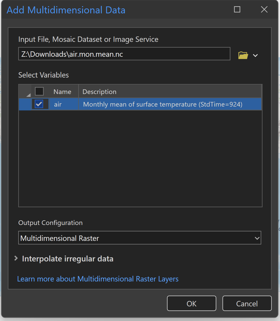
In ArcGIS Pro, create a new project and open up the map. The trick with using the NetCDF file is to not try to just add the data but to use the dropdown for add data and add Multidimensional Data. This will open the specific add data dialog for this kind of data. You can also use geoprocessing tools to load this data but you do not get the multidimensional ribbon that you get when adding the data this way.

When you open the Add Multidimensional Data tool the window will first ask you for the input file (which we just downloaded) and then what Variable you want to show. If you are using the same file that I suggested above, you will only have one variable: air. In this you can change the output to another format (if you want) and Interpolate Irregular data. Often with NetCDFs, there will be a single pixel line at the prime meridian and this can help fix that issue. Click Ok and it will load the data.
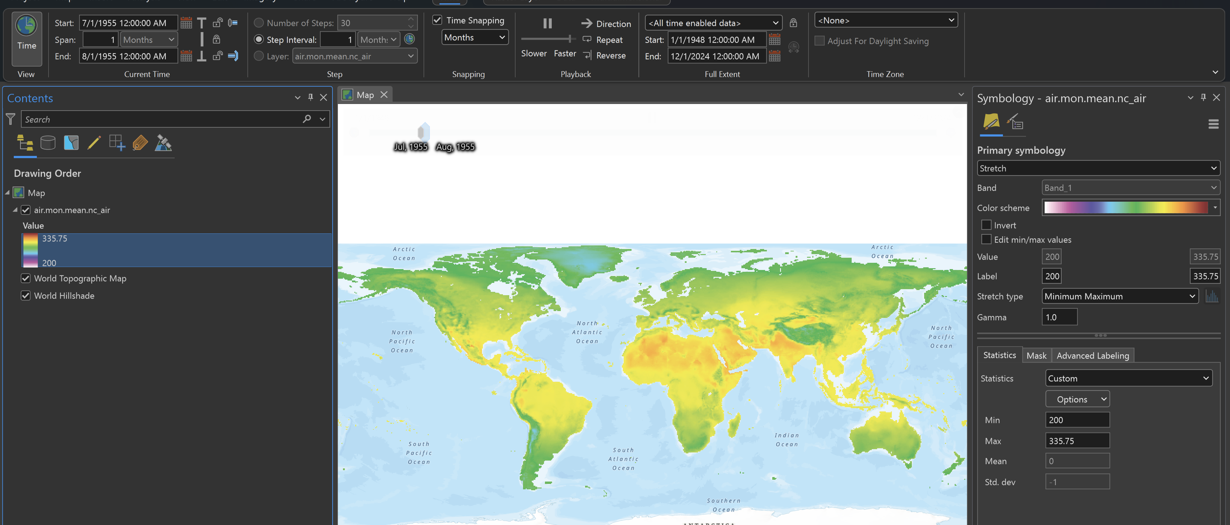
Once the data are loaded, you will see a raster for the whole earth showing temperature in degrees Kelvin. The data are time-enabled, so when it first opens, it will show the whole range of time and values. I would suggest first going into the time ribbon and adjusting the snapping and duration to 1 month. This may take some playing around but once you get it set, you can ani
mate the temperate month to month.
Exploring the Data – Temporal Profile Tool
The next thing we will look at is just to look at the data over a set amount of time. This can be done in the Temporal Profile Tool. This tool allows you to pick any point, line, or polygon and see the underlying data in a graph.

You are also not only limited to one location but you can have many locations. You can also include trend lines and see the statistics of those locations.

Generating a Trend Raster
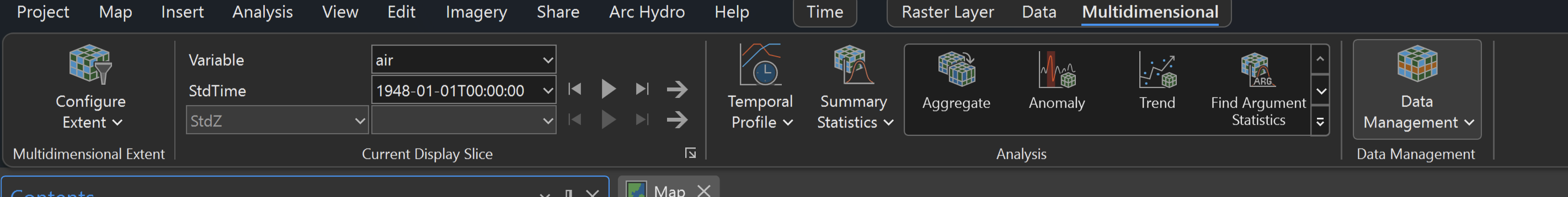
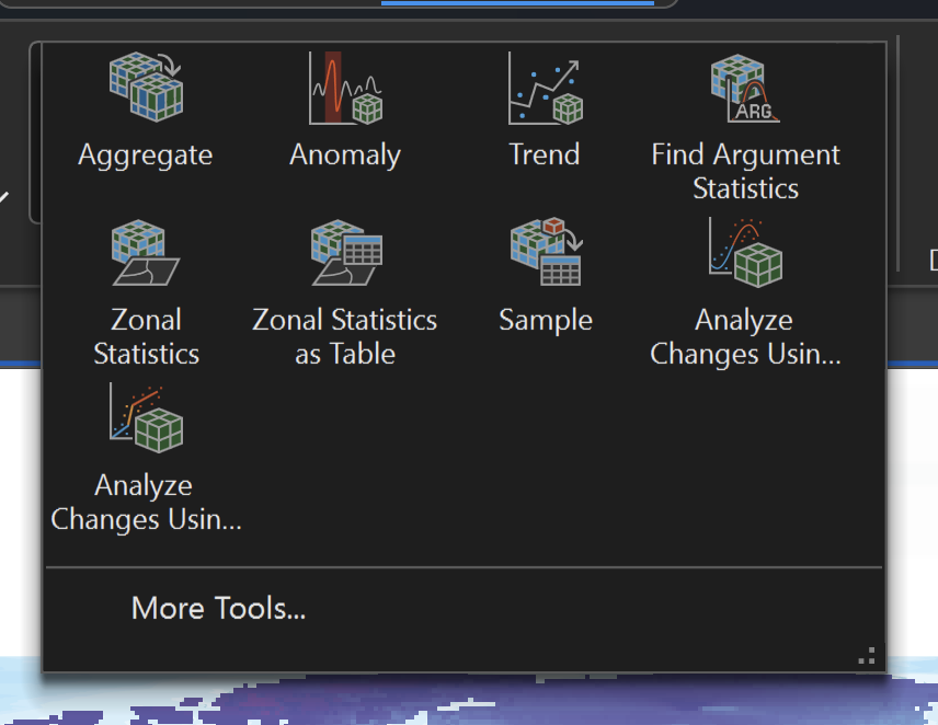
Now we are going to create a Trend Raster. This will allow us to see where the temperature is increasing and decreasing over the course of our data. This will also allow us to do some predictive modeling. The trend tool is found in the Multidimensional Ribbon and is just Trend.
Generating the Trend Raster is easy. Just set your input to be your data and then set your output. Most of the other default options will work well and then you can run it.

Once you have your trend raster it will show areas of increase and decrease over the timeframe. Most of the time these changes are small, but some are overall significant.

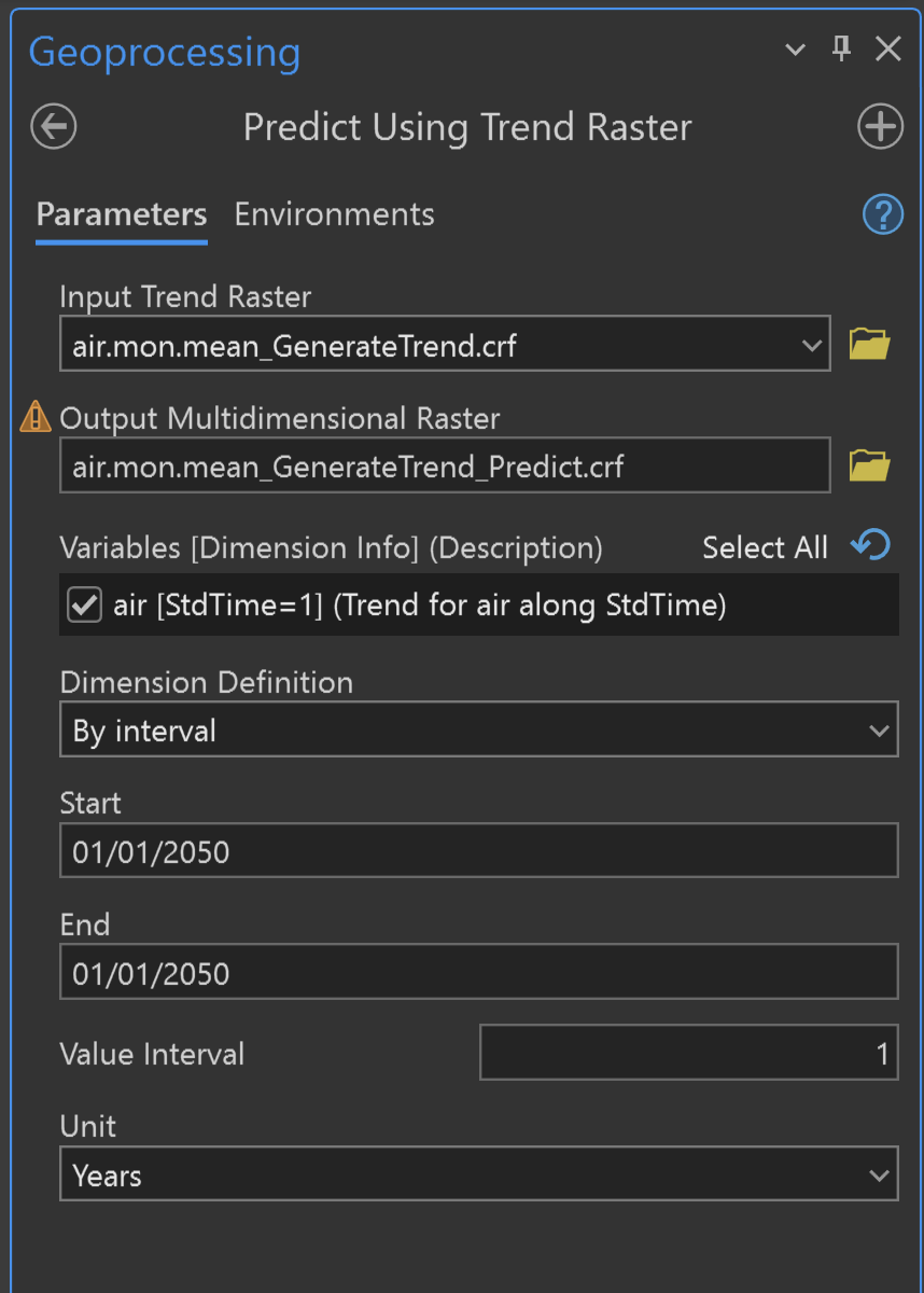
Predicting the Future Temperatures
We can use the Trend Raster we just created to Predict the future. If you notice in your Multidimensional Ribbon a new tool will appear when you select the Trend Raster. You will see the Predict tool.

The Predict Using Trend Raster tools are easy to work with, just like generating the trend rasters. Since the Trend Raster was highlighted for the Tool to appear, it should populate it as the Input. Then, you can set the output name. Normally you would want to set the output to be what prediction you are doing(like airmean2050), but for this example, I am just keeping the default file name. Then you want to set your start and end points and your interval.
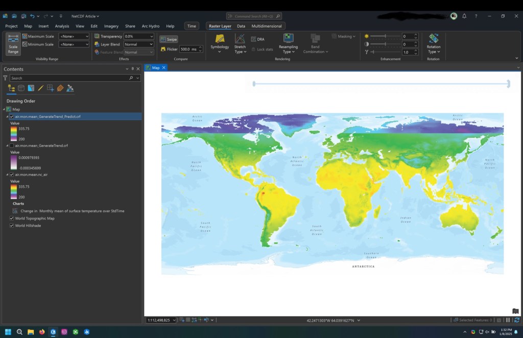
Once you run the tool you will see a new raster that shows the predicted values based on your trend raster. This will be an approximation based on the linear trend created and can be used just to illustrate the change. What you can then do is use the swipe tool and switch between the original and predicted values to show the changes (shown below as the sharp contrast in values).
Now you know a little on using NetCDF data in ArcGIS to Model Climate
Hopefully, this example is useful and just gives a taste of what is possible when you combine ArcGIS and NetCDFs for modeling climate change. The link at the end of this post is to a wealth of other NOAA Climate NetCDFs where you can look at many different variables.
For More NOAA Data Visit the Link Below
https://psl.noaa.gov/data/gridded/data.ncep.reanalysis.html
I will probably not be posting for a little bit, but if you have any suggestions for other things you would like, please reach out to me.
