Design Fiction
A lot of current PhD work and research is about using design fictions to push boundaries and develop discussions of what is needed, even when what is needed is not possible in the current world. Design Fiction is a process much like Geodesign, where you have a tool or process that needs investigating or even just sparking the imagination of what is possible. To better understand, I would recommend the book The Manual of Design Fiction by Julian Bleecker. https://nearfuturelaboratory.com/library/2023/06/the-manual-of-design-fiction-softcover/
In Design Fictions, there are artifacts that may or may not work but help to drive the story in a way that makes it meaningful. In the book, one example was the Communicator from Star Trek. While the technology did not exist, they used it as a McGuffin to drive the story. I can think of so many other devices like this from Issac Asimov’s Robots (there is a great essay in the first Robot City book about this) and Yoshiyuki Tomino’s Gundam series (he often will be quoted as stating the robots were not the point, the story was the horrors of war). The thing is with these artifacts, we connect with them and often attempt to make them real. I have a few articles in the final stages, and I hope to be able to share them soon.
Design Fiction in Cartography
While most of my projects currently are heavily focused on the HCI and Civil Technology realms, I still love going back to cartographic “visualizations.” When I make a map for a contest, I always want to push my technical abilities, but also push what story can be told with what I have. Sometimes I push less for the story and more for the tool (for instance, the 3D printing of maps).
This year, I focused on Data Visualization, but in a minimal sense. Flood maps are so overwhelming at times and hard to find all of the key information, so the goal was to make something so minimal that the flood stood out and the base information made you ask questions. Granted, I was only at the conference for a few hours and only a handful of people asked me about it, but the goal was present.
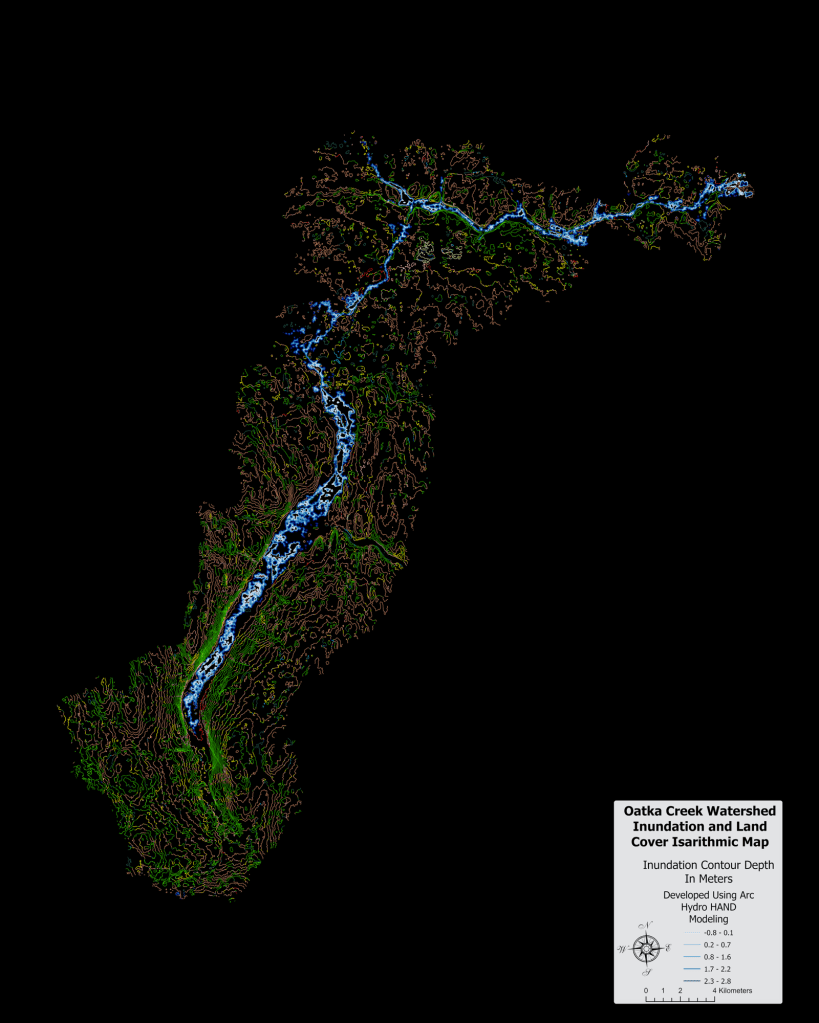
What this map shows is the LULC colors integrated into a contour map. The water inundation is just Arc Hydro HAND modeling. This map actually is easy to make and only requires lots of spatial joins to get it how I wanted it.
Over the Top Design Fiction
The next example map is one I did for a tabletop emergency exercise. The original map was very plain compared to the final one because it was more of a book showing sections, and then the table on the right. There were no 3D renders in the original as well. In the construction of this single layout version, I felt that it was important to not only illustrate the range of the flood but also just how much the water would impact downtown. Shortly before this analysis, the City of Rochester had a 3D model created by Pictometry (now EagleView), and they shared the building layer.
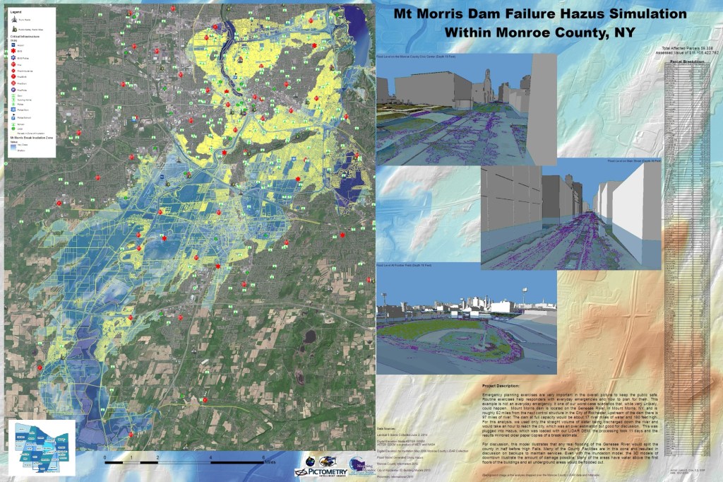
If you are familiar with Tabletop Emergency exercises, they are basically a discussion in drill form of what is needed to respond to an event. Nothing is in real time and serves to just make sure things are in place if something like this occurs. Note this is the worst-case scenario, and only once in the Dam’s lifetime has it come close to being as full as was modeled. As a Design Fiction artifact, this static display helped to understand the impacts, and one tangible outcome was that at the County Emergency Operations Center, they decided to move the back-up generators onto the roof and not on the ground level, which is in the normal flood plain.
I call this over the top for a design fiction because a lot is going on, maybe too much. As a static representation of the problem, it is great, but to many casual observers, there is a lot of information being shared. However, as a Design Fiction artifact, this shows what is possible in terms of the analysis, but also brings new discussion on how to respond. How would you deal with this amount of water when the 200-level seats at the Red Wings are dry, but below are underwater? When I showed this map, I got lots of discussions. I did not know what Design Fiction was at the time, but I think this, for being 10 years old, is a good example of past technology pushing for new discoveries.
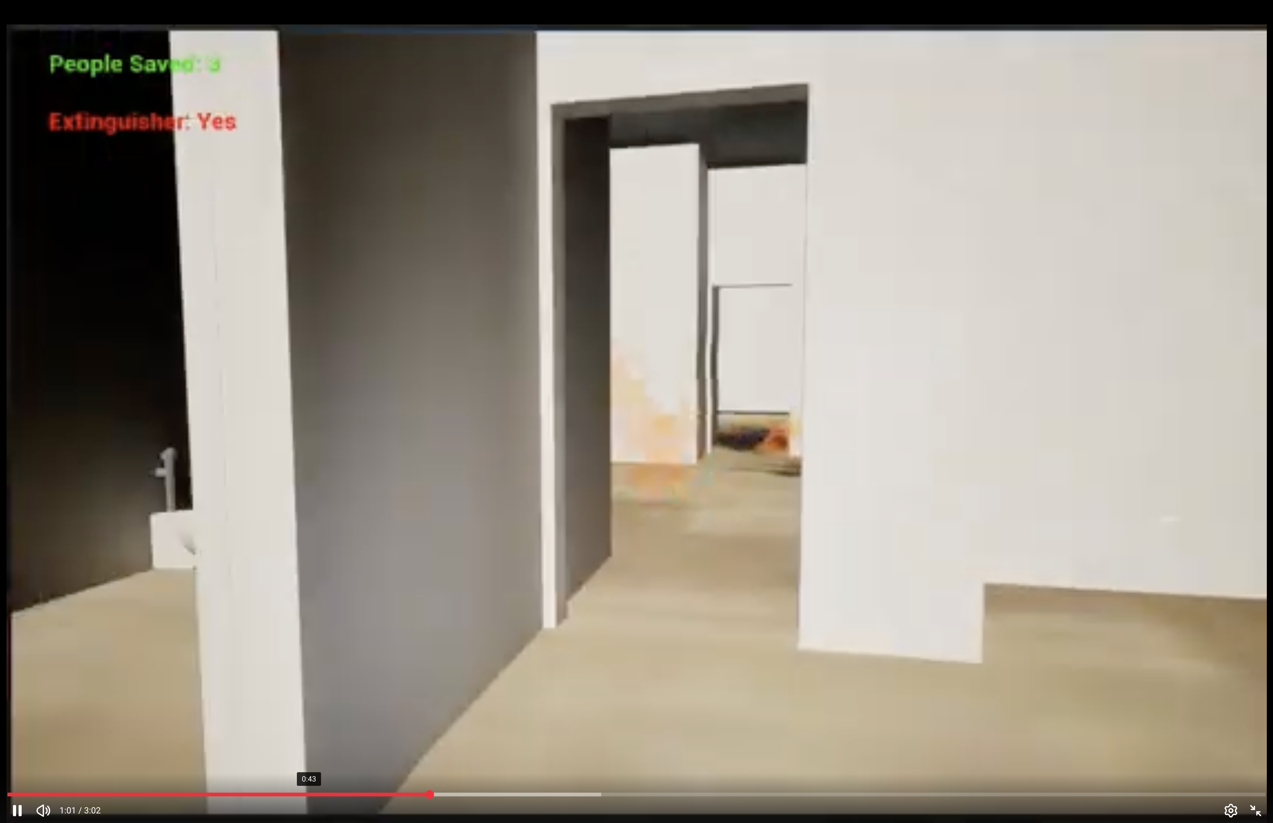
The Future
If you have followed my social media posts, I am currently researching how fire departments’ usage of paper or static maps compares to interactive maps. The next phase uses a game I created using Unreal and ArcGIS SDK, using real-world BIM data to rescue people from a fire. This experiment session will hopefully be over the summer, provided my recovery goes well.