With school starting back up, I wanted to share a workflow that can help administrators look at the chronic attendance issues. One thing that I have seen is when talking with different school administrators, at the individual school level, they do not know of GIS and that Esri provides many tools to them for free.
Many school districts have everything set up and a lot of time it gets lost in a central office with one or two people. Esri has made GIS accessible through ArcGIS Online and does not require a lot of data or training. With this workflow, you can create a map and highlight certain patterns.
Note: This workflow currently uses the Map Viewer Classic and will be updated when all tools are in the new Map Viewer
The Datasets used in this example are
- Random Address Points from http://gis.ny.gov/gisdata/inventories/details.cfm?DSID=921 (I selected a handful to show how to geocode)
- Schools and School District Boundaries from https://gis.ny.gov/gisdata/inventories/details.cfm?DSID=1326
What Data Do you need?
For this workflow, you need a table of addresses and your school’s location in a CSV (Comma-separated values) format. If you are not familiar with a CSV format you can use an excel worksheet and export it to a CSV.
Remember to Save Your Map Often
Getting Started
- Login to ArcGIS Online
- Open a New Map by clicking Map in the Top Toolbar

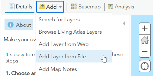
- Now in the map Click Add then Add Layer From File
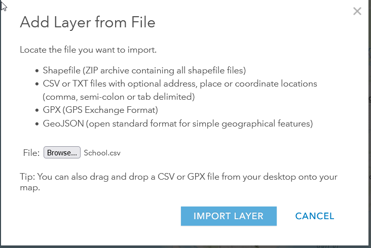
- When the tool opens click Browse and the school’s shapefile zip file that you downloaded from the link above.
- Next, Find your CSV file of the students. Once it is found click import layer.
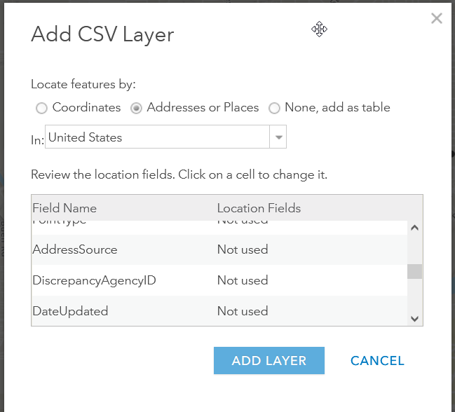
- When adding the CSV you will be asked to match fields to help plot the points. Since you most likely have an address field match those with the wizard below. This process will use credits so be careful to do it correctly and have your data all ready clean and limited to those addresses you want to do. If you try to do an entire school’s worth of points you may run out of credits. (Note: Make sure to have the street number and street name in the same field)
- That will plot the points onto the map.
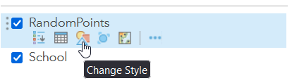
- Now we will change the symbology or style of the points. To do this click on the Change Style icon as seen below.
- You can show the points as a single symbol or you can do something like a heatmap which will show you where there are more points close together.
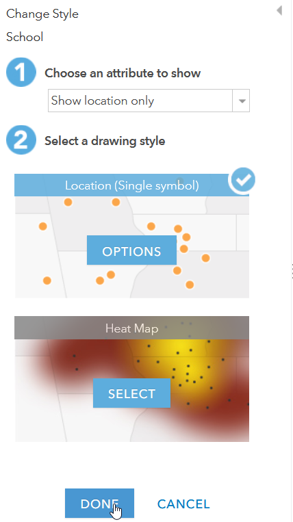
- If you want to change just to one symbol you can click on the Options button.
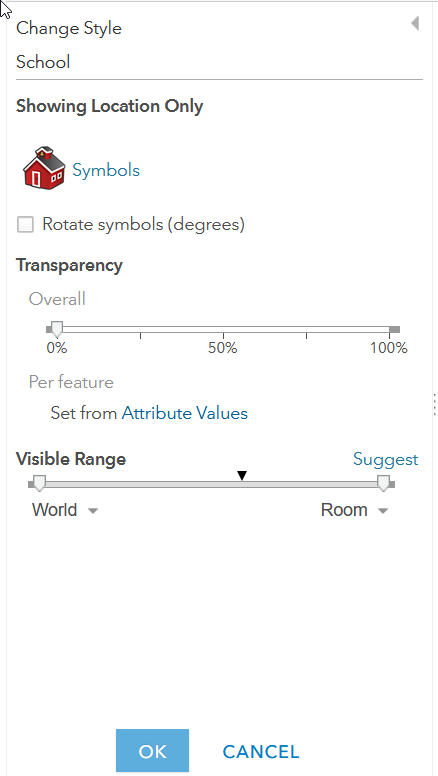
- Then you can change the symbol, its size, and when it draws.
- As you can see below I changed the schools to a school icon.
Performing the Analysis
- Now click on the Analysis tab at the top.
- This will give us access to all of the tools that we will use. We will do 2 different tools to show the differences in looking at the proximity around the schools; Buffers and Drive-Time Areas.
- These tools are found under the Use Proximity Option in the Analysis window.
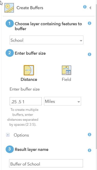
Creating a Buffer Polygon

- First, let us create a buffer. A buffer is a polygon that is created using a radius of a distance that you specify. With a point, the polygon will be a circle, but you can also buffer lines and other polygons.
- Select the Create Buffer tool
- Now in the tool for step 1 set the layer to be the school. (Note: do not try to buffer all of the students because that will not be helpful)
- Now set your distance to what you want to look at. I am using .25, .5, and 1-mile buffers to show the distance. Depending on your school’s rules you can adjust this to match your walking requirements.
- Last give it a name.
- Then run the analysis.
Create Walking Distance Polygon Areas
Most of the time buffers are what people think about when distance around a school. The problem with them is a buffer does not take into account actual walking paths that people may take. ArcGIS Online has a tool that will create both walking distance and walking time polygons that we can use just like the buffers.
- First Open the Analysis and Use Proximity tools just like we did for the buffers.
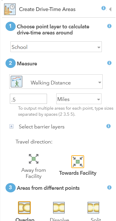
- Click on the Create Drive-Time Areas
- Our point for the analysis is the Schools
- Our measurement will be Walking Distance. In this example, we will just do a half-mile distance.
- Set it to be toward the school because we are looking at how to get students to come to school.
- In this example, we are looking at one school so we do not need to look where the areas intersect.
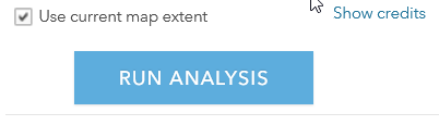
- Once you have the tool set you can run the analysis.
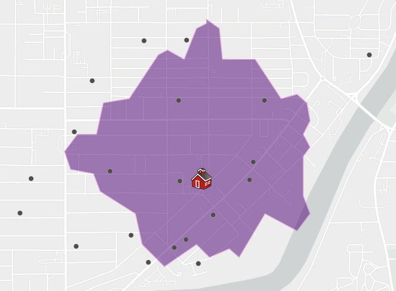
Your results will be more of a weird polygon but if you look closer you will see that it follows the different streets.
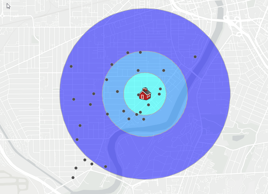
Comparison of the Drive-Time Vs Buffer Areas
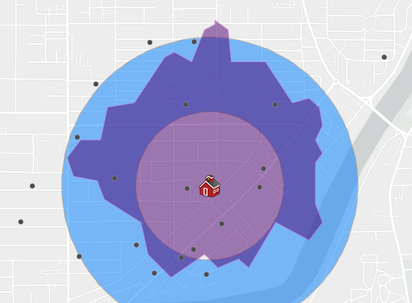
As you can see here, the second ring is the half mile buffer we created in the first analysis. The inner ring is a quarter mile. The walking distance polygon that we created, while a half mile, does not cover the entire half mile area that is in the buffer. Some of the areas are covered completely and other areas are not because of how the walking distances are calculated. The benefit of this analysis is you now know how far someone has to walk to get to school and if there are any barriers that may impede it.
Depending on your need, the buffer analysis may work well, but I prefer the walking distance zones. I have seen major barriers that the walking distance tool takes into account such as limited bridge crossings. One thing that it does not take into account are not mapped walk ways. For example, if you have a park by a school, it may not have all of the cut through mapped or I have seen schools have a path behind the school for walkers which may not be mapped. This is a good case for having the best available data and you can work with your local government to make sure all of the data is up on the Esri basemap system.
Joining our Results to the Students to find Who are within What Polygon
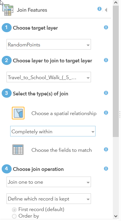
Now that we have these polygons we can now use it to look at the number of students who are in them and who they are. We will have to use the Join Features tool to do this.
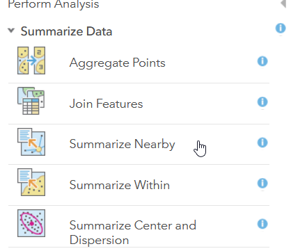
- Open the Analysis tools and go to Summarize Data
- Open the Join Features Tool
- Our target will be the Random Points
- The Layer to Join to Target will be which ever distance polygon you choose. In my example I am using the Walking Distance
- We want to find the points that are completely within the polygons.
- Then you can run the tool and you will get the results.
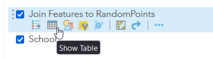
- Once you get the results you will see just another set of points overlaid on the existing ones.
- I would suggest chasing the symbology so you can highlight just those points in your polygon areas.
- You can also click on the Show Table and see a table view of all of the points in the table.
- Now that we have this new layer of points we can export the data to any format that ArcGIS Online does. For example, if you want to create a mailing list of the points you can export it to excel.
- To get to the feature service, click on the top of the map and go to Content.
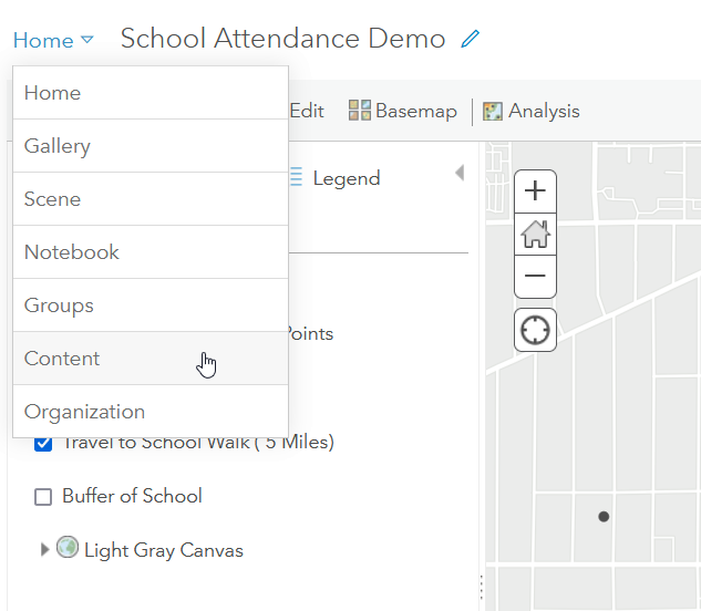
- Now look for your new layer and open it.
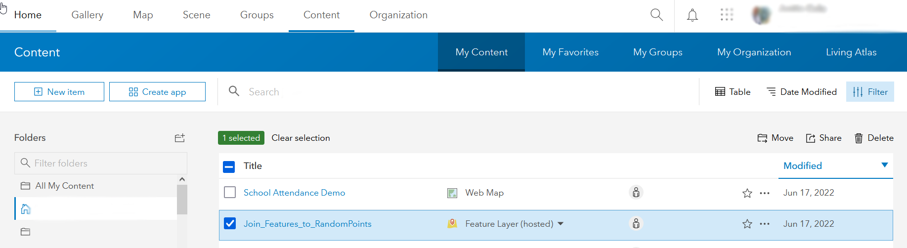
- Once in your Layer you can see on the right of the screen your options.
- Click Export Data and Pick Your Format.
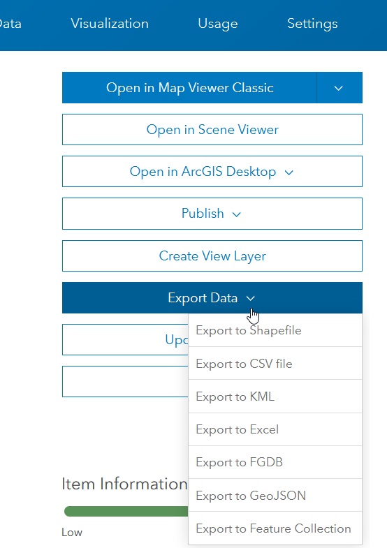
- Then you will be asked what to name and where to save your new file.
- Once the export runs it will automatically open the service with your new file and you can download it.
- One benefit to having it this way is you have it on ArcGIS Online so you can share the file and map within your organization.
If you are not familiar with sharing Maps in ArcGIS Online, I would suggest stopping by the ArcGIS Online Help for Share Items.

Eni said Thanks – one Less Lesson to layout…
LikeLike